
Flexbox is quite a powerful tool once you get a handle on it. I found the Complete guide to Flexbox missing a particular edge case I needed, illustrated here below.

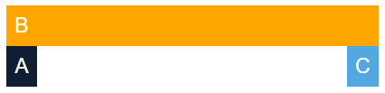
My use case was to only wrap the first and last columns in a flexbox so that on a mobile phone view they would wrap from the sides inwards like the picture illustrates here:
Turns out the CSS Trick to do this is quite straightforward.
First we need to define our HTML code to wrap our 3 internal divs with a single container wrapper.
<div class="wrap">
    <div class="a">A</div>
    <div class="b">B</div>
    <div class="c">C</div>
</div>
Next, some CSS magic:
.wrap {
    display: flex;
    flex-wrap: wrap;
    justify-content: space-between;
}
.wrap > .a {
    background: #0f1e33;
    order: 1;
}
.wrap > .b {
    background: orange;
    order: 2;
    flex: 1;
}
.wrap > .c {
    background: #53a8e1;
    order: 3;
}
@media screen and (max-width: 500px) {
    .wrap > .b {
        background: orange;
        order: 1;
        min-width: 100%;
    }
    .wrap > .a {
        background: #0f1e33;
        order: 2;
    }
    .wrap > .c {
        background: #53a8e1;
        order: 3;
    }
}
And if you really want to spice things up with some colours:
/* Backup CSS code */

body {
  font-family: 'Roboto', sans-serif;
  font-weight: 400;
  font-size: 26px;
  color: #141414;
}

.wrap {
    display: flex;
    flex-wrap: wrap;
    justify-content: space-between;
}
.wrap > .a {
    background: #0f1e33;
    color: white;
    order: 1;
    padding: 10px;
}
.wrap > .b {
    background: orange;
    color: white;
    order: 2;
    flex: 1;
    padding: 10px;
}
.wrap > .c {
    background: #53a8e1;
    color: white;
    order: 3;
    padding: 10px;
}
@media screen and (max-width: 500px) {
    .wrap > .b {
        order: 1;
        min-width: calc(100% - 20px);
    }
    .wrap > .a {
        order: 2;
    }
    .wrap > .c {
        order: 3;
    }
}
Has this been helpful to you?
You can support my work by sharing this article with others, or perhaps buy me a cup of coffee 😊
